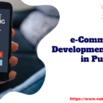

A functional mobile website is essential for any company with an online presence because over 50% of web traffic comes from mobile devices. Despite this, many websites still struggle with their mobile platform compatibility, relying on hover navigation incompatible with touchscreens, click functions too small for fingers, and designs that aren’t made for smaller screens. Web design company, Naksh Technologies, shares essential tips for optimizing your mobile website below.
As a business owner, you most likely already know how critical it is to be active and visible online. Google prioritizes mobile friendly sites over sites that aren’t mobile friendly when listing search results. Considering the oversaturation of websites online, having a mobile optimized website can make your business stand out.
Don’t push visitors to a native application:-
Many companies have taken advantage of the native app building trend in business, creating their own apps for brands, media, and ecommerce. However, many of these companies do so at the expensive of the mobile experience; they limit the user experience or entirely block it with a push to download their native app. While this could be effective for increasing native app downloads, it’s extremely irritating for the casual site browser who has no interest in downloading another app. It can completely ruin the mobile experience.
Tailor accessibility settings for mobile first:-
This means ensuring your website can account for larger text and inverted color schemes, two features that make your website more accessible to people with poorer vision. In addition, your mobile website should avoid any hover functions, as they are rendered useless on mobile touchscreens. Your mobile site should be viewable and functional on any mobile browser, without utilizing any native-code plugins like Java or Flash.
Design for a smaller space without losing your brand:-
Your site’s user experience should be the same on both mobile and desktop. This means making accommodations for smaller screen sizes: automatically resizing images, being serious about decreasing loading times, and using responsive architecture to change your site’s layout to fit within the narrower screens of mobile devices.
Targeting mobile users with a seamless and functional mobile browsing experience will not only help your website standout among the competition, but also give your visitors a quality user experience in every aspect of the online world. Take advantage of the significant increase in mobile browsing traffic today through the 3 essential optimizations above.
About Naksh Technologies:-
Naksh Technologies, a web development company in Pune, helps ecommerce, beauty, SaaS, B2B, and nonprofit businesses create a best-in-class website experience to drive their online growth and improve their overall bottom line. Naksh Technologies’s team of designers and developers work to create memorable websites that tell your brand’s story, improve your key metrics, and display your brand with pride. Balancing memorable brand experiences with user-centric design, Naksh Technologies has amassed an impressive portfolio of case studies with successful clients, helping companies build memorable digital experiences for their brand across various industries.
For More Information
Phone no- 020 41268560
Mail Us- [email protected]
Office No 303,3rd Floor,
Siddhivinayak Keshar Complex,
Near Old Zilla Parishad,431, Station Rd,
Somwar Peth Pune, Maharashtra 411011